RESPONSIVE WEBSITE: THE KEY TO YOUR BUSINESS SUCCESS
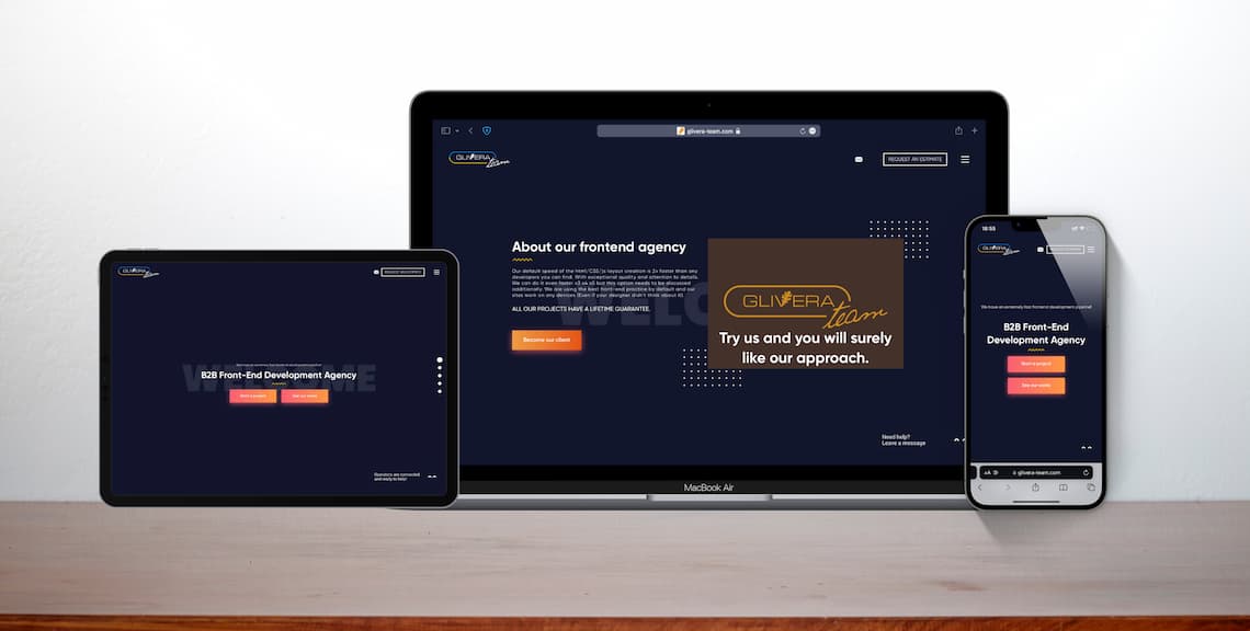
The responsive design will reconfigure all design elements whether it’s viewed on a desktop, laptop, tablet, or mobile phone. With […]
The responsive design will reconfigure all design elements whether it’s viewed on a desktop, laptop, tablet, or mobile phone. With adaptive design, different fixed layouts are created that adapt to the user’s screen size. As opposed to the more fluid responsive approach, adaptive design employs multiple sizes of a fixed design.
Mobile vs. Desktop vs. Tablet
(Source: statcounter)
Apr 2021 – Apr 2022:
Mobile: 58.16%
Desktop: 39.37%
Tablet: 2.47%

5 interesting statistics in 2022
(Source: Statista)
- Over the course of one year, mobile users’ share increased by over 10%.
- 50% B2B inquiries were made on mobile last year.
- About 50% of internet traffic comes from mobile phones.
- 61% of searches are mobile device-based
- More than half of all video views come from mobile devices.
Top-10 Popular Google Keywords of 2021
| Ranking | Keyword | Global Volume |
| 1 | youtube | 1225900000 |
| 2 | 1102800000 | |
| 3 | whatsapp web | 607900000 |
| 4 | 548200000 | |
| 5 | gmail | 438800000 |
| 6 | amazon | 381600000 |
| 7 | translate | 371100000 |
| 8 | google translate | 314600000 |
| 9 | traductor | 287300000 |
| 10 | hotmail | 243500000 |
How does “near me” affect?
Essential for small businesses, location-based searches for a variety of products and services usually happen with mobile devices according to The Search Review. Each major industry category generates different reasons people search for their info, but nearly all local-focused searches occur on mobile devices by people seeking to meet their needs.
Your website needs to be friendly to people viewing through the changing screen sizes used by the devices they carry in their pockets and bags.
For mobile users:
- Load time is furiously fast.
- Your website is responsive to mobile-sized screens.
- Text is legible on mobile as well as desktop screens.
- Buttons are large enough for fingers to activate them easily and spaced far enough apart.
- Color contrast on mobile is enough for easy reading on all screen sizes.
- People who like to research before buying find accessing your website on different screens to be similar experiences, without uncertainty.
For businesses:
- Google rewards mobile-friendly websites by including more mobile-friendly sites in search results for searches on mobile.
- Mobile-friendly sites experience better customer satisfaction, sales, and reputation.
Glivera-Team has been recognized as one of Top Web Development Companies by DesignRush.